|
During doing my thesis project, I've gathered several practical materials on user interface design and some experience about a useful tool to design user interface, Qt Designer. |
|
|
|
PART1.
Something about User Interface design
1.) What is a
"User Interface"?
User Interface refers
to the methods and devices that are used to accommodate interaction between
machines and the human beings who use them (users). User Interface always
accomplishes two fundamental tasks: communicating information from machine
to the user, and communicating information from user to the machine.
2.) What is the
User Interface design process?
|
|
|
| ? Requirements | Determine the requirements for the application |
| ? Conceptual Design | Model the underlying business that the application will support |
| ? Logical Design | Design in general terms how the application will operate |
| ? Physical Design | Design in specific terms how the application will be constructed |
| ? Construction | Construct the application |
| ? Usability Testing | Test the usability of the user interface |
3.) User Interface
design tips and techniques (from Scott W. Ambler's "The ObjectPrimer
2nd Edition, Building Object Application That Work, and Process Patterns",
Cambridge University Press, 2000)
1. Consistency,
consistency, consistency.
The most important
thing that you can possibly do is make sure that your user interface works
consistently. If you can double-click on items in one list and have something
happen then you should be able to double-click on items in any other list
and have the same sort of thing happen. Put your buttons in consistent
places on all of your windows, use the same wording in labels and messages,
and use a consistent color scheme throughout. Consistency in your user
interface allows your users to build an accurate mental model of the way
that it works, and accurate mental models lead to lower training and support
costs.
2. Set standards
and stick to them.
The only way that
you?ll be able to ensure consistency within your application is to set
design standards and then stick to them. The best approach is to adopt
an industry standard and then fill any missing guidelines that are specific
to your needs. Industry standards, such as the ones set by IBM (1993) and
Microsoft (1995), will often define 95%-99% of what you need. By adopting
industry standards you not only take advantage of the work of others you
also increase the chance that your application will look and feel like
other applications that your users purchase or have built. User interface
design standards should be set during the Define Infrastructure Stage (Ambler,
1998b).
3. Explain the
rules.
Your users need
to know how to work with the application that you built for them. When
an application works consistently it means you only have to explain the
rules once. This is a lot easier than explaining in detail exactly how
to use each and every feature in an application step by step.
4. Support both
novices and experts.
Although a library-catalog
metaphor might be appropriate for casual users of a library system, library
patrons, it probably is not all that effective for expert users, librarians.
Librarians are highly trained people who are able to use complex search
systems to find information in a library, therefore you should consider
building a set of search screens to support their unique needs.
5. Navigation
between screens is important.
If it is difficult
to get from one screen to another then your users will quickly become frustrated
and give up. When the flow between screens matches the flow of the work
that the user is trying to accomplish, then your application will make
sense to your users. Because different users work in different ways, your
system will need to be flexible enough to support their various approaches.
Interface-flow diagrams can be used during the Model Stage (Ambler, 1998b)
to model the flow between screens.
6. Navigation
within a screen is important.
In Western societies
people read left to right and top to bottom. Because people are used to
this should you design screens that are also organized left to right and
top to bottom. You want to organize navigation between widgets on your
screen in a manner that users will find familiar to them.
7. Word your
messages and labels appropriately.
The text that you
display on your screens is a primary source of information for your users.
If your text is worded poorly then your interface will be perceived poorly
by your users. Using full words and sentences, as opposed to abbreviations
and codes makes your text easier to understand. Your messages should be
worded positively, imply that the user is in control, and provide insight
into how to use the application properly. For example, which message do
you find more appealing ?You have input the wrong information? or ?An account
number should be 8 digits in length.?? Furthermore, your messages should
be worded consistently and displayed in a consistent place on the screen.
Although the messages ?The person?s first name must be input.? and ?An
account number should be input.? are separately worded well, together they
are inconsistent. In light of the first message, a better wording of the
second message would be ?The account number must be input? to make the
two messages consistent.
8. Understand
your widgets.
You should use the
right widget for the right task, helping to increase the consistency in
your application and probably making it easier to build the application
in the first place. The only way that you can learn how to use widgets
properly is to read and understand the user interface standards and guidelines
that your organization has adopted.
9. Look at other
applications with a grain of salt.
Unless you know
that another application follows the user-interface standards and guidelines
of your organization, you must not assume that the application is doing
things right. Although it is always a good idea to look at the work of
others to get ideas, until you know how to distinguish between good user-interface
design and bad user-interface design you have to be careful. Too many developers
make the mistake of imitating the user interface of another application
that was poorly designed.
10. Use color
appropriately.
Color should be
used sparingly in your applications, and if you do use it you must also
use a secondary indicator. The problem is that some of your users may be
color blind - if you are using color to highlight something on a screen
then you need to do something else to make it stand out if you want these
people to notice it, such as display a symbol beside it. You also want
to use colors in your application consistently so that you have a common
look and feel throughout your application. Also, color generally does not
port well between platform - what looks good on one system often looks
poor on another system. We have all been to presentations where the presenter
said ?it looks good on my machine at home.?
11. Follow the
contrast rule.
If you are going
to use color in your application you need to ensure that your screens are
still readable. The best way to do this is to follow the contrast rule:
Use dark text on light backgrounds and light text on dark backgrounds.
It is very easy to read blue text on a white background but very difficult
to read blue text on a red background. The problem is that there is not
enough contrast between blue and red to make it easy to read, whereas there
is a lot of contrast between blue and white.
12. Use fonts
appropriately
Old English
fonts might look good on the covers of William Shakespeare?s plays, but
they are really hard to read on a screen. Use fonts that are easy to read,
such as serif fonts like Times Roman. Furthermore, use your fonts consistently
and sparingly. A screen using two or three fonts effectively looks a lot
better than a screen that uses five or six. Never forget that you are using
a different font every time you change the size, style (bold, italics,
underlining, ...), typeface, or color.
13. Gray things
out, do not remove them.
You often find that
at certain times it is not applicable to give your users access to all
the functionality of an application. You need to select an object before
you can delete it, so to reinforce your mental model the application should
do something with the Delete button and/or menu item. Should the button
be removed or grayed out? Gray it out, never remove it. By graying things
out when they shouldn?t be used people can start building an accurate mental
model as to how your application works. If you simply remove a widget or
menu item instead of graying it out then it is much more difficult for
your users to build an accurate mental model because they only know what
is currently available to them, and not what is not available. The old
adage that out of sight is out of mind is directly applicable here.
14. Use non destructive
default buttons.
It is quite common
to define a default button on every screen, the button that gets invoked
if the user presses the Return/Enter key. The problem is that sometimes
people will accidentally hit the Enter/Return key when they do not mean
to, consequently invoking the default button. Your default button shouldn?t
be something that is potentially destructive, such as delete or save (perhaps
your user really did not want to save the object at that moment).
15. Alignment
of fields.
When a screen has
more than one editing field you want to organize the fields in a way that
is both visually appealing and efficient. As shown in Figure 1 I have always
found that the best way to do so is to left-justify edit fields, or in
other words make the left-hand side of each edit field line up in a straight
line, one over the other. The corresponding labels should be right justified
and placed immediately beside the field. This is a clean and efficient
way to organize the fields on a screen.
16. Justify data
appropriately.
For columns
of data it is common practice to right justify integers, decimal align
floating point numbers, and left justify strings.
17. Do not create
busy screens.
Crowded screens
are difficult to understand and hence are difficult to use. Experimental
results (Mayhew, 1992) show that the overall density of the screen should
not exceed 40%, whereas local density within groupings shouldn?t exceed
62%.
18. Group things
on the screen effectively.
Items that are logically
connected should be grouped together on the screen to communicate that
they are connected, whereas items that have nothing to do with each other
should be separated. You can use white space between collections of items
to group them and/or you can put boxes around them to accomplish the same
thing.
19. Open windows
in the center of the action.
When your user double-clicks
on an object to display its edit/detail screen then his or her attention
is on that spot. Therefore it makes sense to open the window in that spot,
not somewhere else.
20. Pop-up menus
should not be the only source of functionality.
Your users cannot
learn how to use your application if you hide major functionality from
them. One of the most frustrating practices of developers is to misuse
pop-up, also called context-sensitive, menus. Typically there is a way
to use the mouse on your computer to display a hidden pop-up menu that
provides access to functionality that is specific to the area of the screen
that you are currently working in.
PART2. Something
about Qt Designer
1.) What is Qt?
Qt is a cross-platform
application development framework written in C++.
Qt applications
can be run on Windows 95, 98, NT 4, ME and 2000, Linux, Solaris, HP-UX,
many other Unix's, and the Mac, simply by recompiling. Qt provides
a type-safe alternative to callbacks called "signals
and slots", which is easy to learn and use. You can find Qt
2.3 reference documentation
on-line
and a new version 3.0 is
here.
2.) What is Qt
Designer?
Qt
Designer is a visual GUI design tool, a GUI builder, which allows
you to place and lay out widgets on your forms visually and to preview
them immediately. You can use Qt Designer to connect signals
and slots to give your forms the behavior you want. If you want to customize
the behavior beyond that provided by the default signals and slots, you
can write your own source code directly in Qt Designer. If you prefer
to strictly separate the user-interface from the implementation, you can
easily achieve this by subclassing the forms created using Qt Designer.
You can find the Qt Designer's manual
on-line.
3.) How to use
Qt
Designer to help you design GUI?
Under Windows: (
from Qt 2.3.0 Non-Commercial Edition's README.rtf )
Updating Visual Studio
Qt provides a small
add-in for Visual Studio which you need to install.
1. Start Visual Studio if it isn't already running.
2. Click Tools|Customize to launch the Customize dialog.
3. Click the Add-ins and Macro Files tab.
4. Ensure the checkbox to the left of the "QMsDev Developer Studio-Add-In"
add-in is checked.
5. Click Close.
The add-in is now
installed. A new floating toolbar will appear with the following toolbar
buttons:
· New Qt Project - create a Qt .pro project file and the corresponding
Visual Studio .dsp file.
· Generate Qt Project - create a Visual Studio .dsp file based on
the Qt project .pro file.
· New Qt Dialog - creates a Qt dialog that you can customize with
Qt
Designer. The dialog is automatically added to the Qt .pro project
file.
· Qt Designer - launches Qt Designer.
· Add MOC - add a custom build step which calls moc.exe (meta object
compiler)
· Add UIC - add an existing Qt Designer .ui file to an existing
project.
Creating a Qt Application
Start Visual Studio
if it isn't running already.
1. Click the New Qt Project toolbar button to invoke the Qt New Project
dialog.
2. Enter a project name, e.g. myproject
3. Choose a location for your project, e.g. C:\tmp\myproject
4. Choose an application type. For our example, click Main Window, then
click OK.
A new project will
be created. If you look at the file view you will see that a main.cpp file
has been created as well as files for your own code, myprojectwindow.cpp
with its header, myprojectwindow.h. A moc (meta object compiler) file (moc_myprojectwindow.cpp)
is also created; you can ignore this, it will be automatically generated
as required.
The application
is ready to run, press F7 to build and then press F5 to run.
Customizing the main
window
We will add a menu
bar and a main widget to our main window.
Adding the menu to
the main window
Open the myprojectwindow.cpp
file.
Add the following
header lines:
#include <qaction.h>
#include <qpopupmenu.h>
#include <qmenubar.h>
Add the following
code in the myprojectWindow constructor:
QAction *fileNewAction
= new QAction( "New", "&New", CTRL+Key_N, this, "new" );
QAction *fileQuitAction
= new QAction( "Quit", "&Quit", CTRL+Key_Q, this, "quit" );
QPopupMenu *fileMenu
= new QPopupMenu( this );
menuBar()->insertItem(
"&File", fileMenu );
fileNewAction->addTo(
fileMenu );
fileQuitAction->addTo(
fileMenu );
Here we create two actions: actions may be used for keyboard accelerators, menu options and toolbars. We create a new menu and add our two actions to the menu. Press F7 to build, then F5 to run. The program will run and the new menu will work - but it hasn't any functionality yet.
To make the Quit option work we need to add another header file and a signal/slot connection. (If you want to learn more about signals and slots, see the on-line documentation provided, i.e. signalsandslots.html.)
Add this header file:
include <qapplication.h>
Now add the following
code:
connect( fileQuitAction,
SIGNAL( activated() ), qApp, SLOT( quit() ) );
If you compile and run the application the File|Quit menu option will now work. qApp is a global pointer, available in all Qt programs, that points to the QApplication instance.
Adding the main widget (control) to the main window
Most main window-style applications are built around a central widget. We'll make a QTable our main widget, by adding another header file and some more code.
Add this header file
to qmyprojectwindow.h (our header file):
#include <qtable.h>
In qmyprojectwindow.h
add the following private variable to the myprojectWindow class:
QTable *table;
Now add the following
code to qmyprojectwindow.cpp:
table = new QTable(
52, 12, this );
table->setFocus();
setCentralWidget(
table );
Creating a dialog with Qt Designer
We'll now add a dialog to our application.
Click the New Qt Dialog toolbar button. This will start up a sequence of two dialogs.
In the File Save As dialog, choose a name for the dialog, e.g. newdocument.ui, then click Save.
Click Yes in the Question dialog. A DOS window will appear momentarily.
The following files
have been added to your project:
· newdocumentimpl.h - this file contains the subclass's declarations
and is where you specialize them
· newdocumentimpl.cpp - this file contains a subclass of the dialog
and is where you add your own code to specialize it
· newdocument.ui - this is the Qt Designer file that contains
your dialog's design and is used to generate the other files
· newdocument.cpp - this file contains the dialog class; it is created/updated
by Qt Designer
· moc_newdocument.cpp - a moc file that is taken care of automatically
and can be ignored
· moc_newdocumentimpl.cpp - a moc file that is taken care of automatically
and can be ignored
· newdocument.h - the dialog's header file; it is created/updated
by Qt Designer
We will now create a basic dialog.
Qt Designer
is a powerful layout-based dialog design tool. It has on-line documentation
if you are unfamiliar with it. We'll just place a couple of widgets (controls)
on the form and then see how to launch the dialog from our main window.
1. Double click newdocument.ui in the file view to run Qt Designer.
2. Delete the "Place your widgets" label and the Apply button. (For each
of them just click them, then press Del.)
3. We'll now add some widgets to the form and lay them out:
i. Click the Button Group toolbar button then click in the middle of the
form.
ii. Click the form then click the Lay Out Vertically toolbar button to
make the button group fill the available space.
iii. Click the Radio Button toolbar button then click on the button group.
Repeat this twice more so that you have three radio buttons in a rough
vertical alignment.
iv. Shift+Click the unselected radio buttons so that all three are selected,
then click the Lay Out Vertically toolbar button.
v. Click the button group and click the Lay Out Horizontally toolbar button.
vi. Resize the form using the size grip (bottom right corner) to make is
smaller.
We won't bother naming the widgets or giving them sensible labels since we just want to show you how to integrate Qt Designer forms with a Visual Studio Qt project.
Click File|Exit, then click Yes, to save the changes to the dialog.
Calling the dialog from the main window
We'll add a new slot which we'll use to execute the dialog we've created.
Change the myprojectWindow's
definition in the myprojectwindow.h file to this:
class myprojectWindow
: public QMainWindow
{
Q_OBJECT
public:
myprojectWindow(
QWidget* parent = 0, const char* name = 0, WFlags f = WType_TopLevel );
public slots:
void newDocument();
private:
QTable *table;
};
We'll now implement
the slot in myprojectwindow.cpp file. Firstly add our dialog's header file:
#include "newdocumentimpl.h"
Now add the new slot
to invoke the dialog modally:
void myprojectWindow::newDocument()
{
newdocument *docDlg
= new newdocument( this, "new", TRUE );
if ( docDlg->exec()
) {
; // user clicked
OK
}
else {
; // user clicked
Cancel
}
delete docDlg;
}
Finally we need to
connect the File|New menu option to the newDocument() slot. We do this
by adding another connect call in the myprojectWindow constructor, after
the connect we wrote earlier:
connect( fileNewAction,
SIGNAL( activated() ), this, SLOT( newDocument() ) );
If you build and
run the application, both the File|New and File|Quit menu options will
work, File|New causing your dialog to be displayed. Click either the dialog's
OK or its Cancel button to close it.
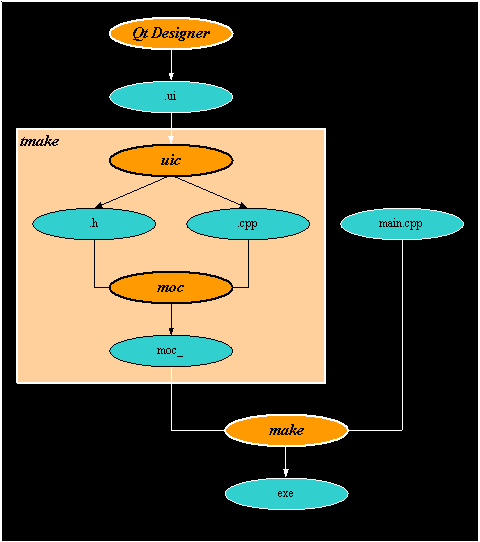
Under X11:
Qt Designer
generates the .ui file which is XML format.
Create a .pro file
which can be produced a makefile by tmake.
You don't need to
put the files which can be generated by tmake in .pro file.
Here is a sample
.pro file:
| TEMPLATE
=app
CONFIG +=qt warn_on release HEADERS = SOURCES =project_example.cpp TARGET =project_example INTERFACES =interface_example.ui REQUIRES =full_config |
A brief picture on
the sequence of the procedures gives below.
4.) What's new
in QT 3.0.2?
The lastest version
adds a lot of new features and improvements.
1.) A new database
module added.
2.) Include a plugin
architecture, which makes possible to create own plugins and third party
plugins.
3.) Add lots of
new classes, such as QDockArea, QTextEdit, QSettings, QProcess, etc.
QT Designer: once
was a pure dialog editor in QT 2.2, now has been extended to a full functionalitional
GUI design tool. Which includes
1.) Lay out main
windows with menus and toolbars.
2.) Actions can
be edited within and then plugged into toolbars and menu bars via drag
and drop.
3.) Add new approach,
functionality can be extended via plugins for custom widgets so that they
can be used as real widgets inside the designer.
QMake: a new tool to replace tmake.
More information
is at http://doc.trolltech.com/3.0.
to be continued ...